
UX Research | UX/UI Design | Mobile App | Master's ThesisSKYE: Rethinking the way we approach mental health support.
A mobile app concept exploring how AI could make mental health resources more accessible, personalised and easier to navigate.
01 | Project overview
SKYE was my Master's thesis and final UX Design project, exploring how digital technology could help make mental health support more accessible to younger generations.
The idea was to create a mobile app that brings together different forms of support in one place, from guided journaling and mood tracking to educational resources, crisis support and an AI-powered chat feature.
The project began with research into the challenges Millennials and Gen Z face when seeking mental health support. Using those findings as a starting point, I developed the concept, designed the entire app experience and built an interactive prototype to demonstrate how the service could work.
02 | The challenge
Making support easier to access.
Mental health is something younger generations are increasingly open about discussing, but knowing where to find support, and actually accessing it, can still be difficult.
Through my initial research, I explored some of the barriers people face when looking for help, including limited access to professional support, uncertainty about where to turn and the need for resources that feel more personal and approachable.
This led to two main questions:
How can we make mental health resources and support more accessible to Millennials and Gen Z?
And, with AI becoming an increasingly prominent part of everyday technology:
How can AI be used responsibly to offer a more personalised experience while keeping the user's wellbeing, privacy and safety at the centre?
03 | Research & discovery
Understanding the people behind the problem.
I started by looking into the existing challenges surrounding mental health support, particularly among Millennials and Gen Z. To better understand the target audience, I conducted 18 user interviews, exploring people's experiences, attitudes towards mental health and expectations of digital support services.
I also consulted with psychology professionals to gain a better understanding of the subject and ensure that the proposed features considered psychological perspectives.
The research helped shape the direction of SKYE, highlighting the importance of creating an experience that felt approachable, easy to navigate and adaptable to different needs.
04 | Early concepts & wireframing
From initial ideas to a structured experience.
With the initial research in place, I began exploring how the different ideas could translate into an actual mobile experience. I started with rough sketches to map out possible layouts, explore different approaches and work through how the main features could come together.
From there, I developed the initial concepts into low-fidelity wireframes, focusing on the app's structure, navigation and user flows before moving into the visual design. This helped me establish a clear foundation for the experience and consider how users would move between the different sections of SKYE.
I used this stage to experiment, make adjustments and refine the overall structure before developing the final interfaces.
05 | Developing the interface
Refining the designs and establishing the visual direction.
With the research, initial sketches and wireframes in place, I moved on to developing the high-fidelity designs. This was where the overall structure started to take shape visually, as I began defining the colour palette, typography, layouts and individual interface elements.
I worked through each screen in more detail, refining the navigation, visual hierarchy and interactions to create a consistent experience across the app. I also explored how the different features could be presented in a way that felt intuitive and easy to use, while giving SKYE its own recognisable visual identity.
Once the individual screens and interactions were developed, I brought everything together into an interactive prototype, allowing the full experience to be explored and tested.
06 | The solution
Introducing SKYE.
The app was designed around several interconnected features, each serving a different aspect of the user's mental wellbeing.
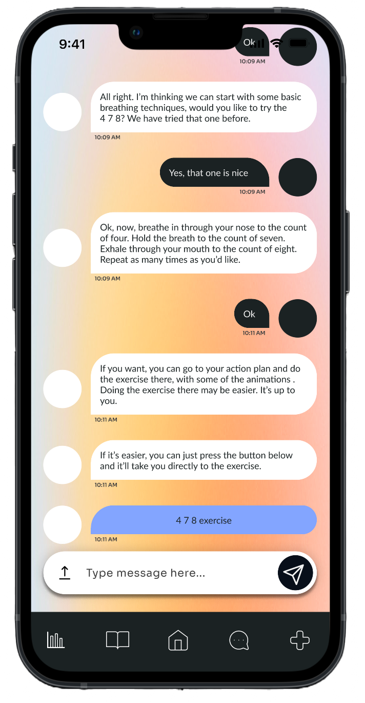
AI-powered chat
A conversational support feature designed to respond to different user inputs and situations, offering tailored guidance within predefined limitations.
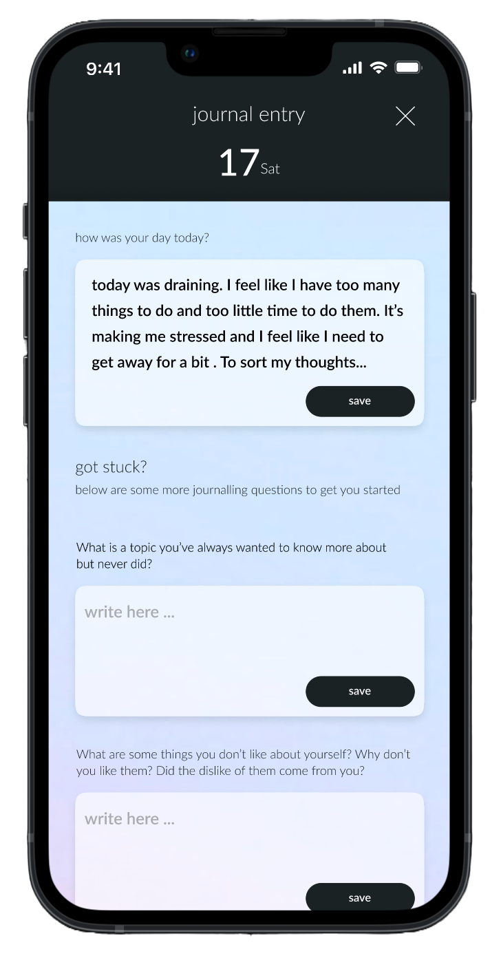
Guided journaling
A space for users to reflect, write down their thoughts and work through guided prompts. Users could also revisit previous entries and use journaling as part of their self-discovery journey.
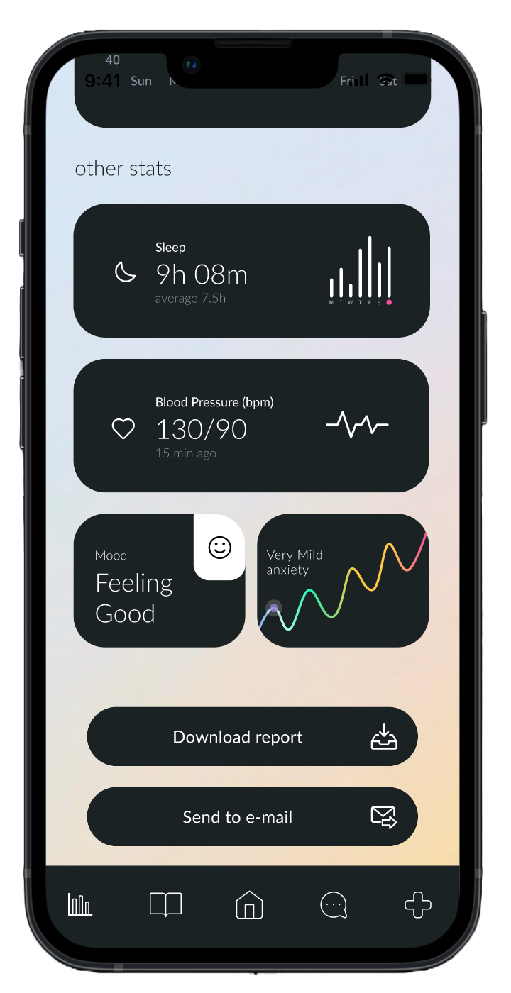
Mood tracking & progress
Tools to monitor mood and overall wellbeing over time, view progress and download personal data in report form.
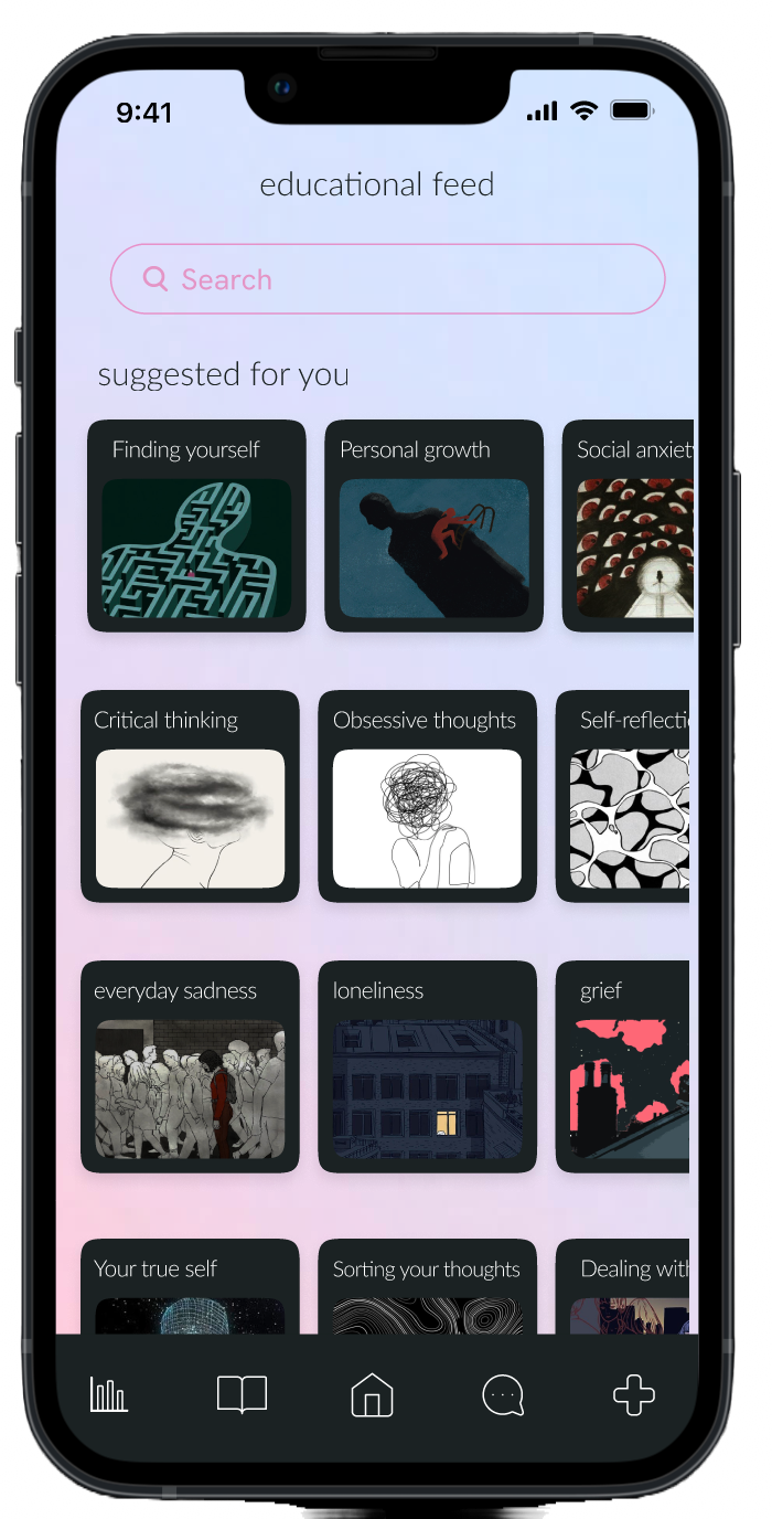
Educational library
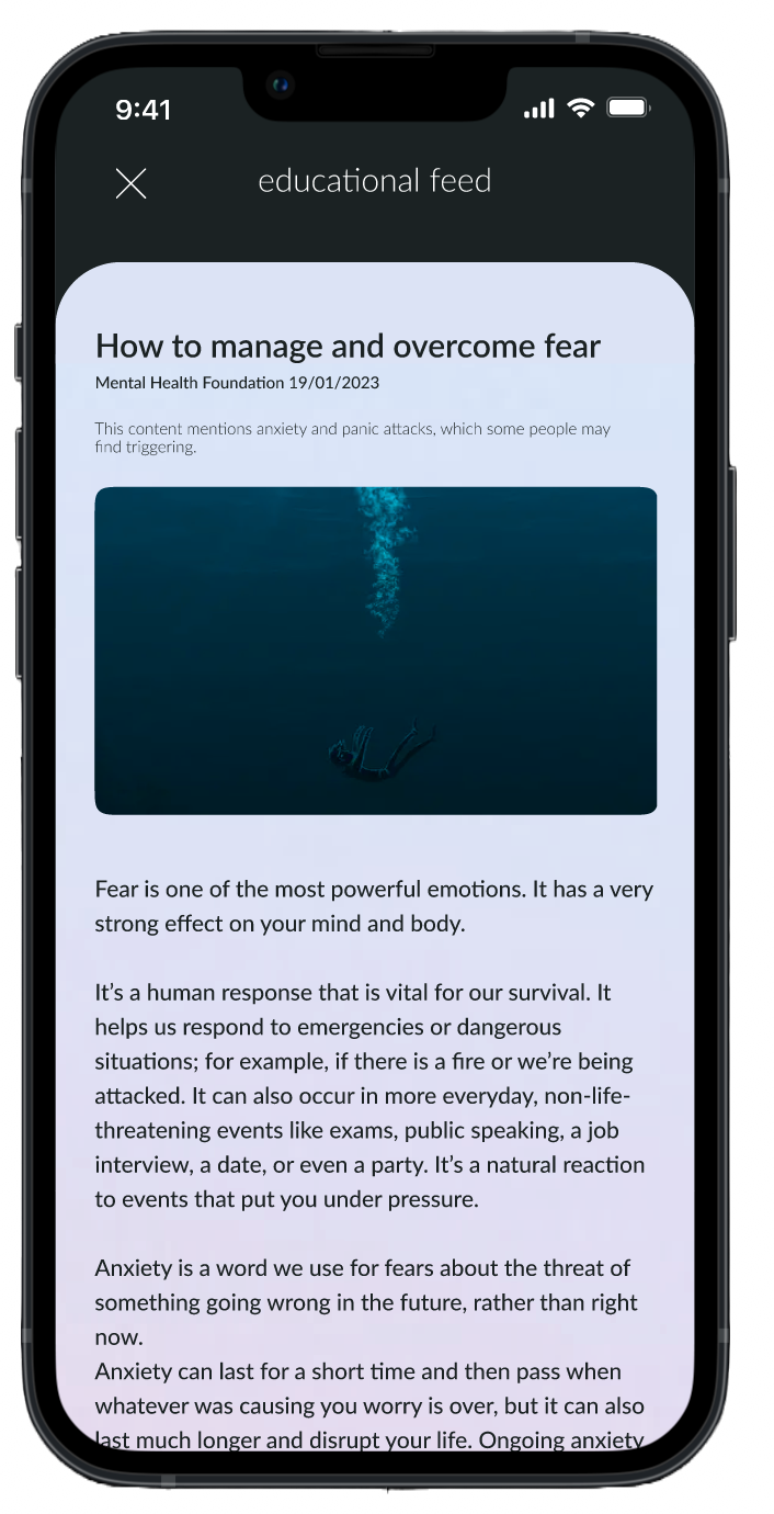
A collection of articles and resources from verified sources, helping users learn more about mental health and explore topics relevant to them.
Crisis support & action plans
Access to internal exercises such as guided breathing, as well as external support contacts and helplines. Action plans offered different activities depending on what the user needed.
07 | Visual direction & interface
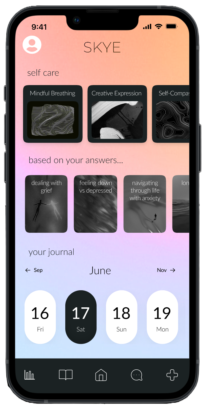
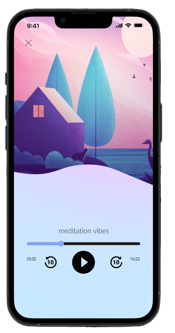
For the visual direction, I wanted SKYE to feel welcoming, calm and approachable without looking overly clinical. I explored soft gradients, pastel colours and darker contrasting elements to create a visual identity that felt modern and recognisable.
I also wanted the interface to feel consistent across the different sections of the app, while allowing each feature to have its own character. Particular attention went into the navigation, readability and small interaction details to make the overall experience feel cohesive and easy to use.
08 | Testing & outcome
Taking the concept into an interactive prototype.
The final outcome was a fully designed interactive mobile app prototype, bringing together the complete user experience, from the main navigation and core features to individual interactions and user journeys.
I tested the prototype with several users to gather feedback on the overall experience, usability and functionality. The feedback was positive and helped validate the direction of the concept, while offering further insight into how the experience could be improved.
Although the app was designed around the potential of AI and machine learning, the technical development and testing of those components fell outside the scope of the thesis. The project focused on researching, designing and testing the user experience, providing a foundation for what could be explored in future development.
09 | Reflection & learnings
What I took away from the project.
Working on SKYE gave me the opportunity to take a project from an initial idea all the way through to a fully designed and interactive prototype. It allowed me to bring together different parts of the UX design process, from conducting user research and exploring early concepts to developing the visual identity, designing the interface and testing the final experience.
One of the biggest takeaways was understanding how important it is to approach sensitive topics like mental health with care and consideration. It also gave me the opportunity to explore the possibilities of AI in digital products, while recognising the importance of responsible implementation and the limitations that come with it.
Overall, SKYE was a valuable project that challenged me to think beyond the interface and consider the wider experience, the people using it and the impact a digital service could have.